Barrow of Tulips
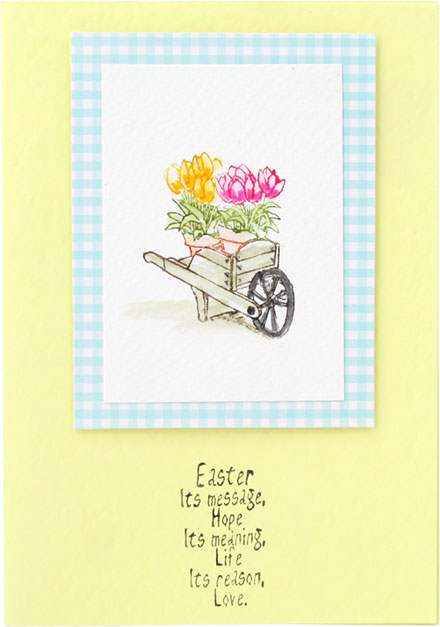
by Gina MartinAlways ground your stamped image so they don't appear to be floating. Try to use colours that are in your main design. Gina here has used the same colour as the cart to create the wash of shadow under the wheelbarrow.
Products used:- SO: Marvy LePlume II Pen - Brown
- SO: Marvy LePlume II Pen - Jungle Green
- SO: Marvy LePlume II Pen - Vermilion
- SO: Marvy LePlume II Pen - Magenta
- SO: Marvy LePlume II Pen - Sepia
- SO: Marvy LePlume II Pen - Black
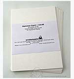
- Hammer Card - 25 x A5 Sheets - White
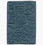
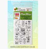
- Door Ways - Unmounted Stamps - April May
- SO: Door Ways Clear Set - April - May

